Multidimensional Maps That Provide New Perspectives on New York City
The world’s most mapped city, as you’ve never seen it before.

The Upper East Side is literally leafy. Pear, oak, ginkgo, and Japanese pagoda trees line one of the cities’ wealthiest enclaves. Ocean Hill, Brooklyn, on the other hand, an area with an unemployment rate of nearly 13 percent, has entire blocks without a single tree. In 2015, the artist and developer Jill Hubley mapped thousands of individual trees from the 52 most common species in New York on one enormous digital map. South Brooklyn is replete with plane trees, poplars are sparsely dotted all over the city, and white-blossomed callery pear trees fill the streets along Central Park. It’s a new way of looking at the most populous city in North America—and just one of 19 maps making up You Are Here NYC: Art, Information, and Mapping, a free exhibition at the Pratt Manhattan Gallery on view until November 15, 2017.
Formally, these 19 maps run the gamut, from digital to quilting to water-based sculpture. But each has data at its core, represented in some new and interesting way. “In this day and age, we’re just bombarded by information, because we’re surrounded by computers that can chew it up and spit it out in untold numbers of ways,” says Katharine Harmon, the exhibition’s curator, who authored a 2016 book of the same name. “Your eyes glaze over, after a while. If we can look at information in new and unexpected ways, it kind of wakes up our brains a little. It enables us to actually take it in. To pay attention.”

The maps employ a variety of different techniques to seize attention. Some, like Hubley’s map of trees, are interactive and reward engagement. Chris Whong, a specialist in urban planning at New York University’s Wagner Graduate School of Public Service, achieved some viral fame in 2014 for his digital map NYC Taxis: A Day in the Life. His hypnotic visualization, which can be sped up or slowed down, tracks a random taxi (a different one each time it loads) as it moves across the city, from destination to destination, with and without riders in the back seat. In the meantime, the fares and tips slowly accumulate. At its heart is open-source trip and fare data from the NYC Taxi & Limousine Commission. The source may be pure information, but the map provides an intimate account of a driver’s subjective experience, says Harmon. “You’re just putting yourself in that taxi, driving that taxi, and imagining what that’s like.”

Other maps use form to communicate something subjective about that data. The charity Quilters Without Borders produced The Asthma Quilt in 2017, a vast, 60-by-80-inch fabric patchwork made of discarded industrial scraps. Each color-coded block shows asthma incidence by census tract, with the locations of public housing projects and area hospitals embroidered in. The map is about a health problem, says Harmon, but it’s also about poverty and inequality. “That information is coming to you in such an unexpected way—a soft, beautiful quilt. But then, a quilt can also be smothering.... It’s really interesting how those two things work together. The medium, and the content.”
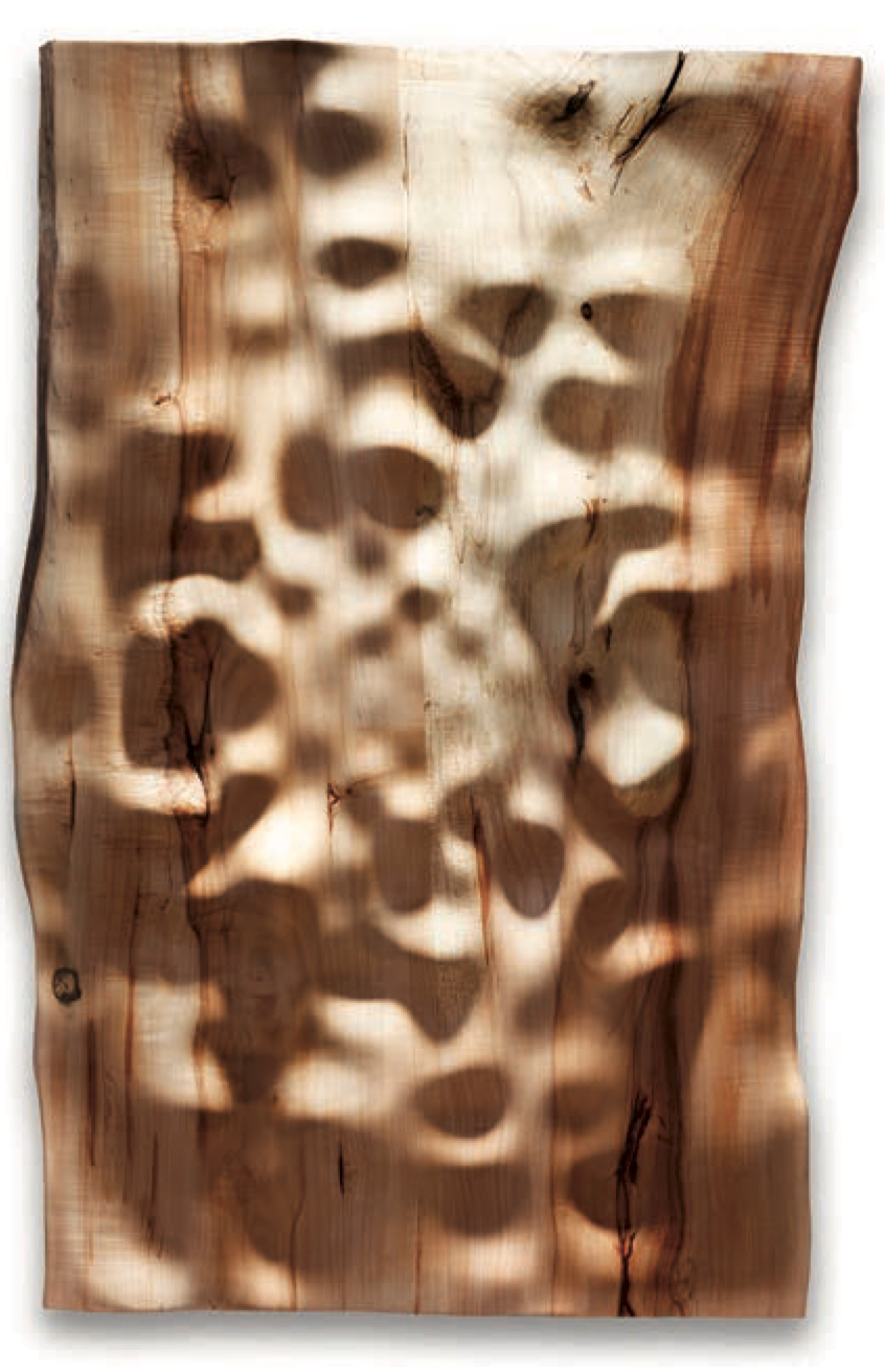
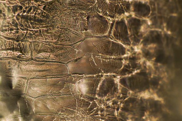
Erica Sellers’s 2013 piece The Grind, sculpted from silver maple wood, looks less obviously like a plan of the city. The rippling panel is a visual representation of audio clips recorded over a month of the artist’s life—over coffees with friends, lubricated nights out, walks in the snow, the whirr and grind of her commute. It is a time capsule of that month, the undulating soundscape of a very particular New York experience onto reclaimed local wood. Is it really a map? Yes, says Harmon. First and foremost, it is a visual reflection of information. More than that, “it is a representation of place, but it’s an auditory place.”

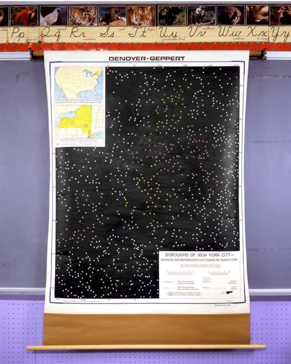
One multimedia map, by Pratt students Xingying Du, Michelle Htar, and Jessica Silverman, is at once personal and impersonal. In Journeys: Disconnected – Reconnected, the designers track the individual paths of the entire lives of 66 people now buried on mile-long Hart Island, home to the city’s potter’s field, the largest tax-funded cemetery in the world. Its permanent residents’ bodies were either unclaimed or given up voluntarily for burial by the city. The cemetery, like the city itself, is a melting pot, say the designers, and each colored strand reveals the great distances its inhabitants (their names are listed in the key) traveled before arriving at their final, shared destination. Ilona Fehrer began her life in Budapest, in 1910. Yori Sandler was born 21 years later, in Italy. Both, along with thousands others, wound up on Hart Island. On the map, their threads tangle with those of dozens of others.
The oldest known map of New York, then called New Amsterdam, dates to 1660. Since then, the city has been mapped in almost every way imaginable. The city creates an endless amount of data, says Harmon. “And a seemingly endless amount of very creative people are there to analyze it and interpret it.” This exhibition reveals just some of the many innovative ways residents find to explore, analyze, and represent the metropolis. “I really do believe it has to be the most mapped city in the world,” says Harmon—yet hidden within that infinite data are more untold stories, still waiting to be laid out.


Follow us on Twitter to get the latest on the world's hidden wonders.
Like us on Facebook to get the latest on the world's hidden wonders.
Follow us on Twitter Like us on Facebook