The Puzzling Provenance of Historic Hebrew Type
It’s hard to match the letters with their creators.

A few decades ago, Richard Rockford was about to buy some vintage wooden typefaces from an American antique dealer when the seller pulled open one last drawer. It was where he kept a shoebox-worth of non-English letters orphaned from their original alphabets, hoping someone might eventually adopt them. “He was like, ‘Oh and here’s some foreign type,’” remembers Rockford, a Buffalo-based found materials artist who turns old machinery scraps into sculptures. “He didn’t even know what it was.”
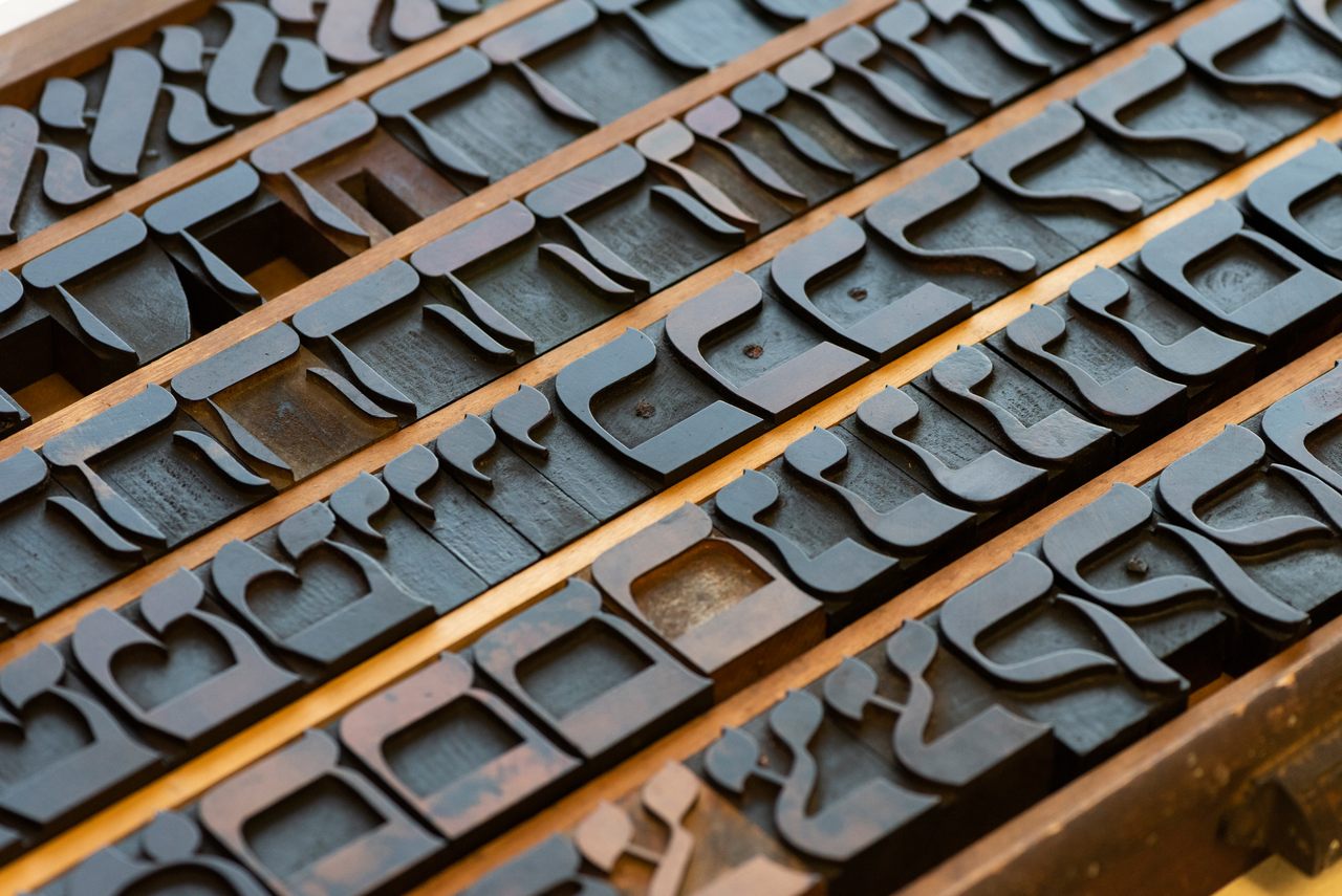
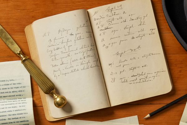
But Rockford did. He’d been collecting it for years. There were curlicued lameds and serifed tafs, a handful of the 22 letters in Hebrew’s right-to-left alphabet sitting in the cabinet of a person who could neither identify nor read them. Rockford could decipher the ancient Levantine script, but not explain how it had ended up in a dusty American antique shop. As it turns out, reading Hebrew type is the easy part—figuring out where historic Hebrew block letters came from is the real puzzle.
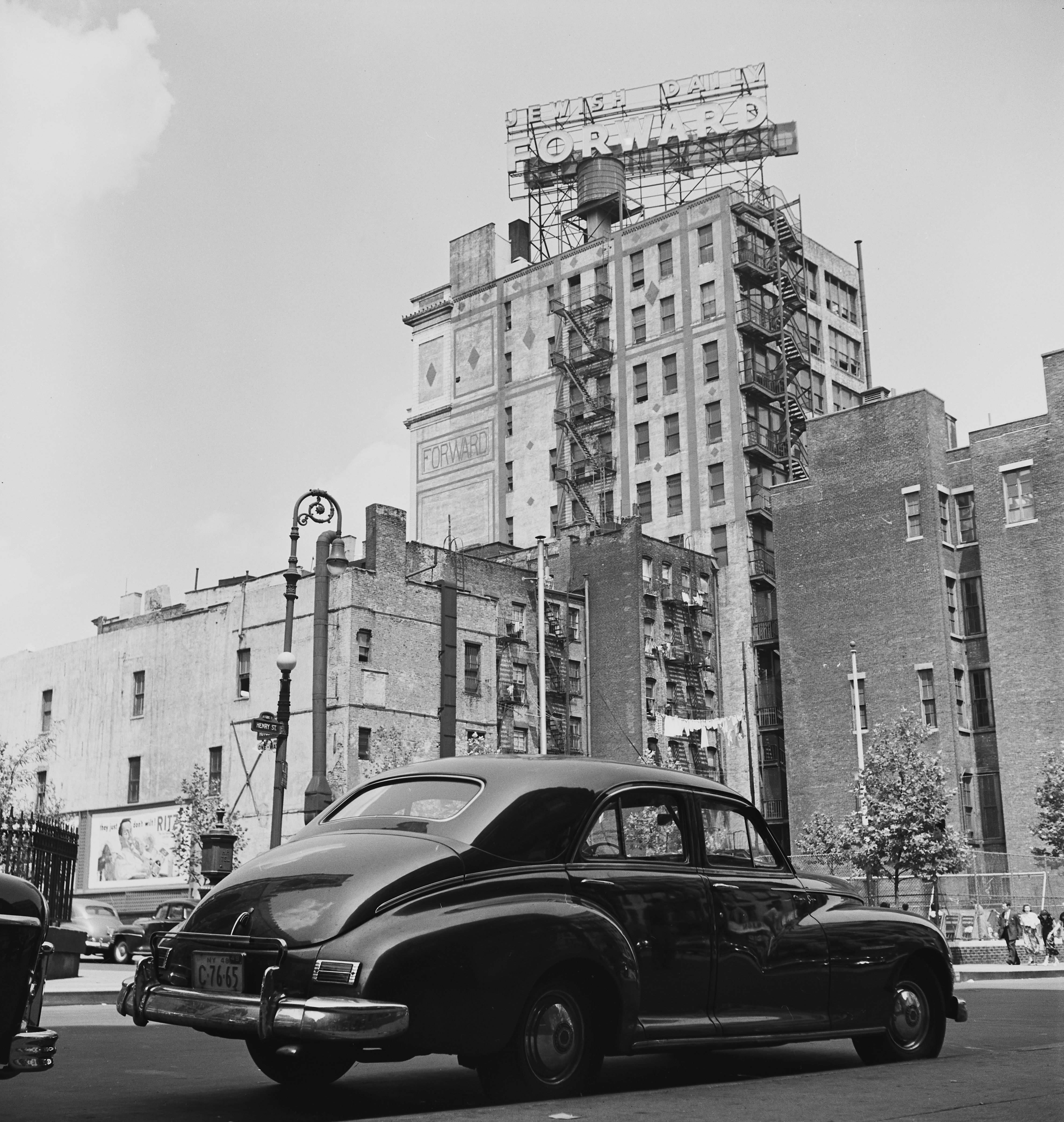
In Rockford’s experience any vendor who could identify the language of these scarce typefaces claimed they came from a single source: The Jewish Daily Forward. Established as a Yiddish-language newspaper in New York in 1897, it is now published online as The Forward in both English and Yiddish (a language developed by European Jews and written in Hebrew characters).
A Forward provenance was cited for the first set of wooden Hebrew typefaces Rockford bought in the early 1970s. Decades later, he bought more trays of Hebrew wooden type from another seller who repeated the refrain that they were from The Jewish Daily Forward. “You could tell they were the same patina, the same age, the same fonts as what I already had,” says Rockford.
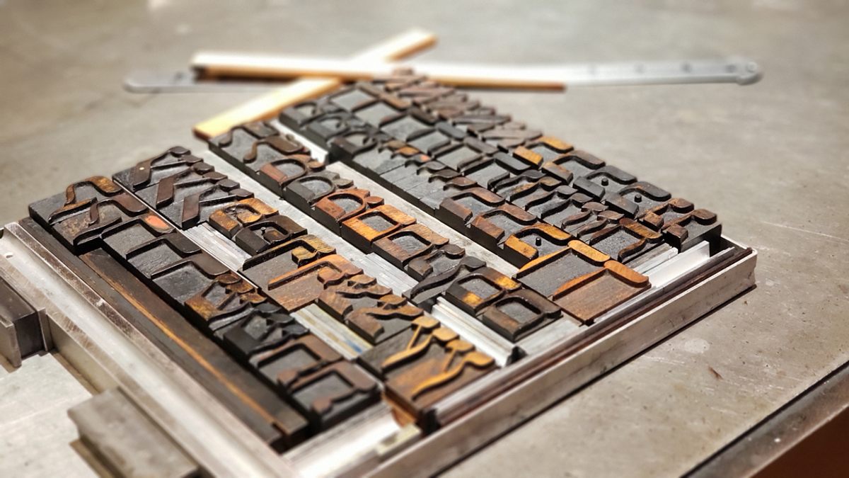
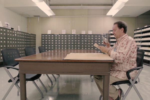
When Rockford closed his big warehouse studio a few years ago, he wanted his collection of 42 timeworn Hebrew alphabets (which he used sparingly in sculptures, deeming them too precious) to go somewhere meaningful. He offered them to the Cary Graphic Arts Collection, a typographic library at the Rochester Institute of Technology where they’ve since been cleaned, organized, letterpress printed, and are now being studied by assistant curator Shani Avni, who is also an Israeli designer.
Avni started her research, naturally, by calling the archivist at The Forward. “The first thing she told me is that she gets so many phone calls from people telling her, ‘I have the letters that were used for The Forward,’” recalls Avni. There’s no way that all of those letters could have the same provenance—the paper wouldn’t have needed so many. But Avni understands why it’s many people’s first guess. “The Forward was so impactful, it was such an important part of the Jewish community and how we assimilated into the U.S., so that’s your go-to, right?” she says.
But if these Hebrew typesets weren’t used to print The Forward, how else did they end up in upstate New York and the American midwest, where Rockford bought them? That’s what Avni is trying to find out.
Historic Hebrew typefaces are rare in the United States and elsewhere, because this three-millennia-old language has had a unique** print run. Hebrew typefaces appeared in Italy and Spain soon after Johannes Gutenberg invented the printing press in 1440, with the oldest printed Hebrew books being religious texts dating to the 1470s. The typefaces used for printing the Hebrew script were limited both in scope and style when compared with their Latin counterparts.** “In Europe, very broadly speaking, you would need two conditions to exist [to see Hebrew type]: one is the existence of a Jewish community, and the second is for that community not to be persecuted by the local authorities,” Avni explains. “The fact that they had to relocate and flee and move their presses and their types greatly affected this whole process of creating letters or maintaining their conditions to be printed in the best way, or designing and manufacturing new letters.”
That was certainly the case in America, even though it would eventually become a center of Hebrew printing. Jews who immigrated to America in the 19th century resemble the European communities Avni described, with many relocating to avoid persecution. It’s hard to imagine that lugging heavy lettering sets would have been a priority. Avni’s challenge is to figure out not only where Rockford’s typefaces were used, but also where they came from. “This is a huge question,” Avni says. “I’ve been trying to get some answers for a while now.”
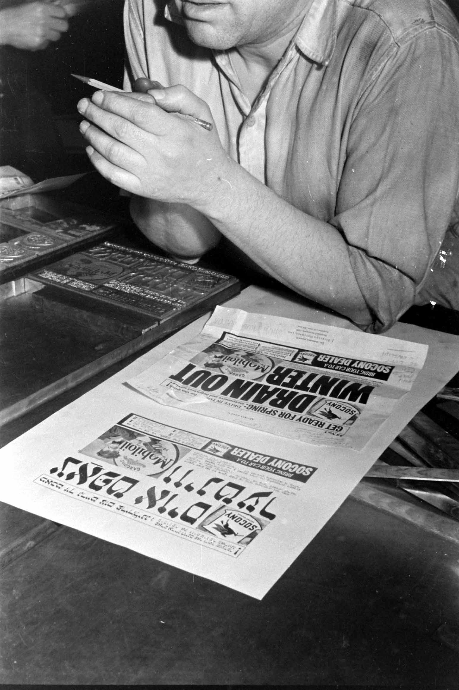
Latin typesets usually have manufacturer imprints on the side of the letter A, but none of the Hebrew typefaces in the Cary Collection retain any such clues. So Avni is working backwards, looking at the few places that manufactured Hebrew typefaces in the U.S. in the 19th century and studying their type specimens (marketing materials that factories used to sell fonts to typesetters). Avni is following a hunch that the typefaces were American-made, since they match American type sizes*. And since she was looking at American manufacturers, Hamilton Wood Type in Wisconsin emerged as a logical contender because it was a prominent factory (that is now, conveniently, a graphic museum).
Apart from figuring out where they came from, Avni is also studying the letters themselves and their scars sustained during lifetimes of improvised repairs. Whether they came from Wisconsin or Poland, they were hard to replace: Because the materials’ intended readership was always relatively small, few manufacturers made the letters. Letterforms would keep stamping words until they lost a leg or an eye (such as the rounded mark that differentiates a P from an F or a pey from a fey), then printers would hammer in some kind of makeshift prosthetic and march them off to the presses again. “You can see that these poor letters have been through so, so much,” Avni sympathizes. Letterpress printing is technically challenging, because printers must transfer a legible imprint onto the page without allowing the weight of the press to mar the letterforms. While other languages had centuries to develop fonts that endured these stresses, Hebrew lagged behind and struggled to stand up to continuous use.
The language’s long tradition of being used for handwritten religious texts—but not secular printed matter like novels, receipts, or pamphlets—also stunted the development of its print typography. “Hebrew has developed in such a unique way that you can’t see in other scripts,” explains Avni of how early specimens like those at the Cary Collection expose how sustained letterpress printing forced the type to adapt.
The letter ayin (ע), for example, was usually handwritten with a descender (the part of a letter that dips below baseline, like lowercase letter p). Avni was surprised to find that almost every ayin descender in the Cary Collection had broken off because they were diagonal and not reinforced, as the rest of the letter was. After seeing how often these dangling legs broke, typesetters took creative license and filed down the descenders so that they stayed on the baseline. “They didn’t have any other ayin,” Avni shares. “You need to print this poster, you need to print the newspaper today, and you need to spell words that have ayin in them. And all your ayins are broken. What are you gonna do?” In the next evolution of Hebrew typeface designs, instead of reinforcing the ayin descender, manufacturers just reproduced what they were seeing in print—chopped* ayins.
Visitors to the Cary Collection will soon be able to study its Hebrew typefaces themselves, since each individual set of letters will have a call number that you can request—just like a (deconstructed) library book. Maybe some future library patron will help solve the mystery of how this wooden alphabet either came to America or came to be made there. Avni hasn’t yet figured it out, but she knows that, as with many other foreign typesets, it was used by newcomers who cherished their old country’s mother tongue. An immigrant community wanted to keep its old language as it was acquiring a new one. Or in simple terms, Avni says, “someone needed those letters.”
*Corrections: This story originally referred to American paper sizes, instead of type sizes, and described the tweaked ayin as “condensed.”
**Updates: In a Twitter thread, a reader raised concerns that this story initially dismissed the scope and volume of material printed in Hebrew. We have tweaked the story to clarify that the writer and source here are primarily talking about the wood type itself, not the material printed with it, and to emphasize that any mentions about the volume of printed material are comparisons to the volume of material printed in Latin.


Follow us on Twitter to get the latest on the world's hidden wonders.
Like us on Facebook to get the latest on the world's hidden wonders.
Follow us on Twitter Like us on Facebook