7 Maps That Only Could Have Been Made in the 20th Century
 Detail from Mare Undarum, Lunar Map (Image: Courtesy of UChicago Press)
Mapmaking may now be a more popular activity than in any other time in history—every time a person looks for directions online, a new, customized map is born. Just a century or so ago, none of the mapmaking tools we now take for granted existed, and a new book The History of Cartography, Volume 6: Cartography in the 20th Century, released this month by UChicago Press, traces the incredible advances in the last century that made possible the map-obsessed world of today.
In the 20th century, “there was an explosion of mapping,” says Mark Monmonier, the geology professor who edited the new volume. Cartographers could see the world from above—first from airplanes, then from space. And maps went electric: old maps were converted into digital form, satellites captured topographical data digitally, and born-digital maps became increasingly interactive. “The electronic transition definitely the 20th century more than anything else,” Monmonier says.
The encyclopedic History contains a wealth of rich illustration: We’ve pulled out seven maps that only could have been made in the 20th century—and a bonus map from the 21st that shows how far cartography has already progressed in contemporary times.

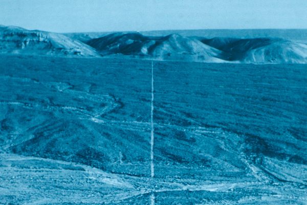
1909
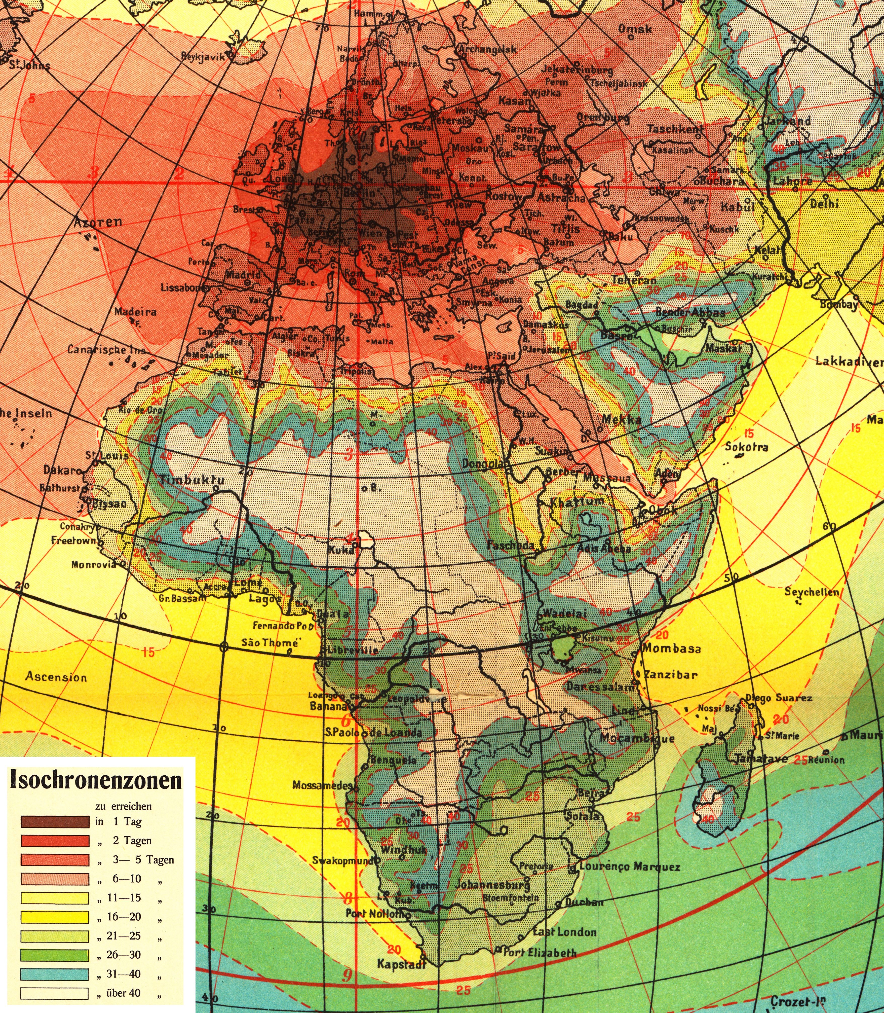 Travel Time in Days from Berlin at the Start of the Twentieth Century (Image: Courtesy of UChicago Press)
In 1909, traveling far from home still meant traveling over land or getting on a ship. This maps shows how long it would take to travel any place in the world from Berlin. The most remote place in the world, from a European perspective, was still the center of Africa. Timbuktu, in the continent’s west, is just on the edge of what was then accessible. But, as Monmonier points out, the map also show the impact of the Suez Canal: “There’s that red arm branching out towards the southeast,” he points out—an indication that the canal made a whole new part of the world accessible.
1944
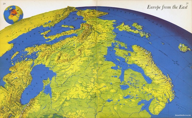 Europe from the East (Image: Richard Harris Eden/Courtesy of UChicago Press)
Richard Edes Harrison made maps for Fortune and Life magazines. “He had an atlas that came out during World War II that tried to expand, for people in the United States, the impression of the distances involved,” explains Monmonier. Americans would have been familiar with the standard map of Europe, with north at the top. But if you look east at Europe, from the perspective of the Soviet Union, England seems much further away.
1950
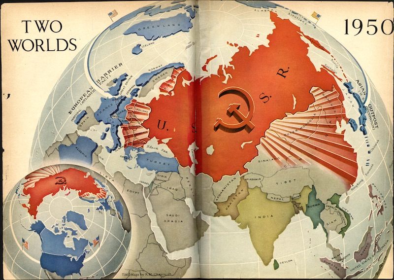 Anticommunist Polar Project Map (Image: Robert M. Chapin/Courtesy of UChicago Press)
Once the Cold War settled in, though, magazines tried to emphasize how close the United States and the Soviet Union actually were. This map, from Time, “emphasizes the fact that North America is not as far from the Soviet Union, as you might think,” Monmonier says.
1950
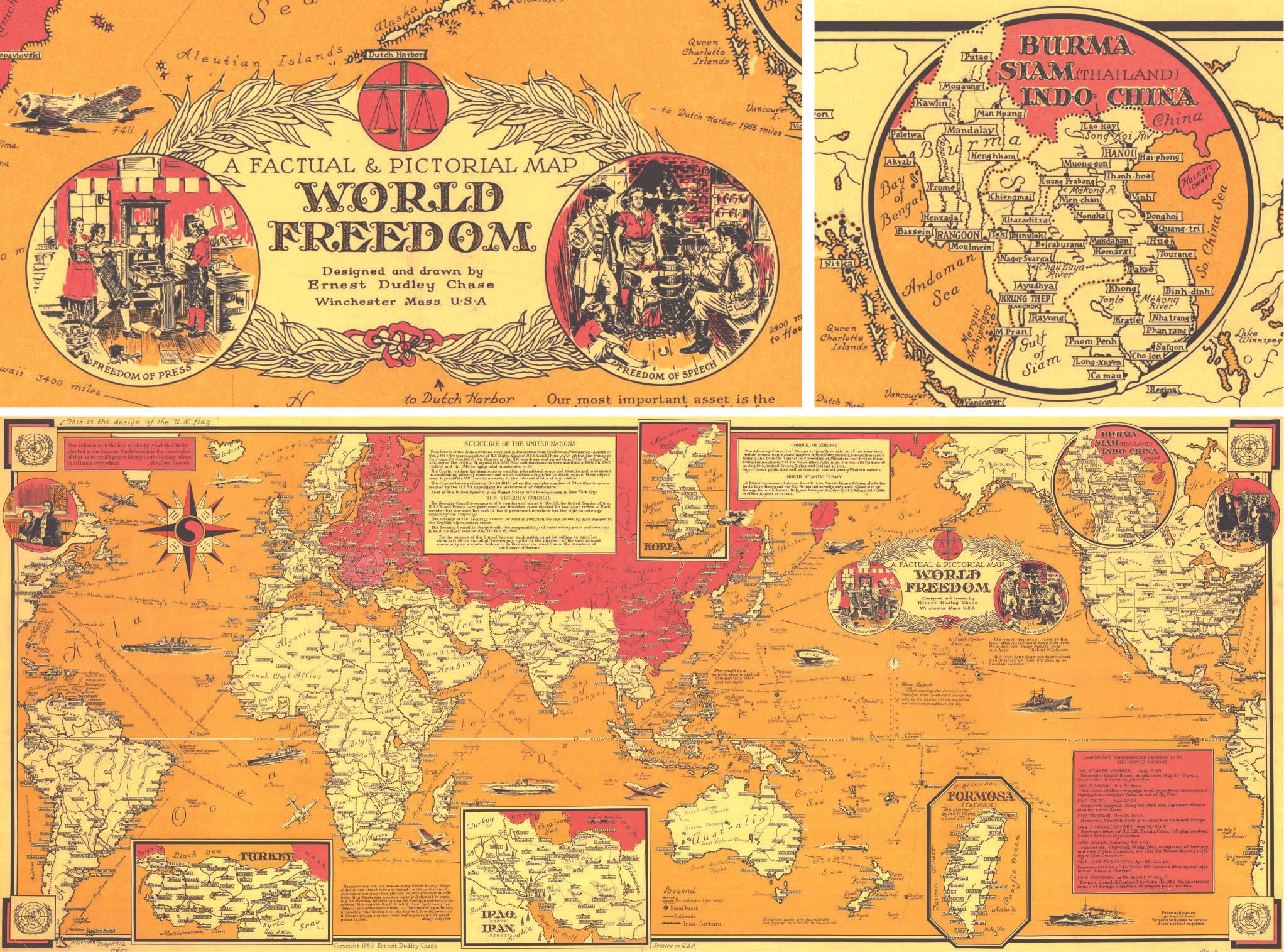 A Factual & Pictorial Map of World Freedom (Image: Ernest Dudley Chase/Courtesy of UChicago Press)
Maps were sometimes used as propaganda tools. Mapping “World Freedom,” in this instance, meant painting Russia red. The map was meant to honor the creation of the United Nations.
1976
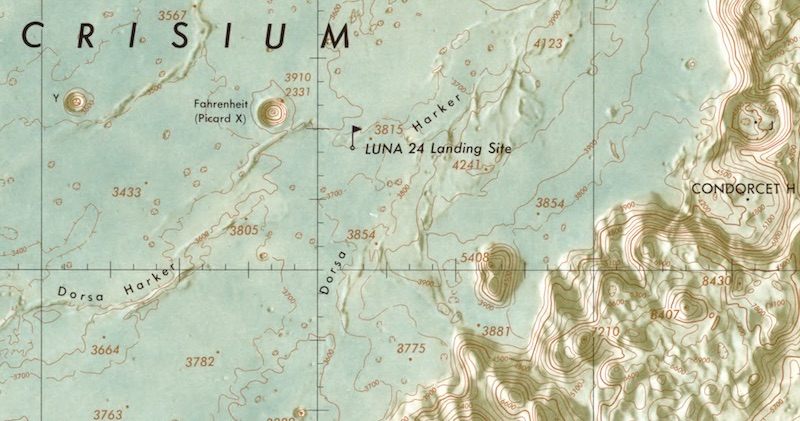
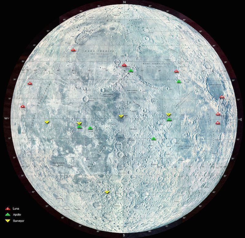 Lunar Landing Site Map (Image: Courtesy of NASA Goddard Space Flight Center/UChicago Press)
“There were 19th century maps of the Moon, because Moon isn’t that far away,” says Monmonier. But this one has much more accurate impression of the lunar surface. And it reflects the new age of exploration, in which, like 14th and 15th century explorers, astronauts would travel to unknown parts and plant a flag. This maps documents the landing sites for the USSR’s Luna missions, from 1956 to 1976, and the American Apollo and Surveyor missions, spanning the years from 1966 to 1972.
1978
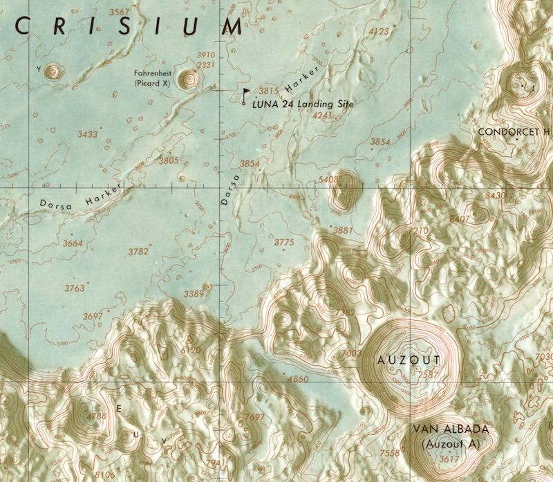
Detail from Mare Undarum, Lunar Map (Image: Courtesy of UChicago Press)
Even on the moon, the U.S. was quite concerned with Communist activity. Making this detailed map required data from satellites circling the moon. “That imagery allows you to draw the contour lines,” Monmonier says. “The same technology was used by the US when overflying the Soviet Union and making maps so we could understand what was going on there.”
1998
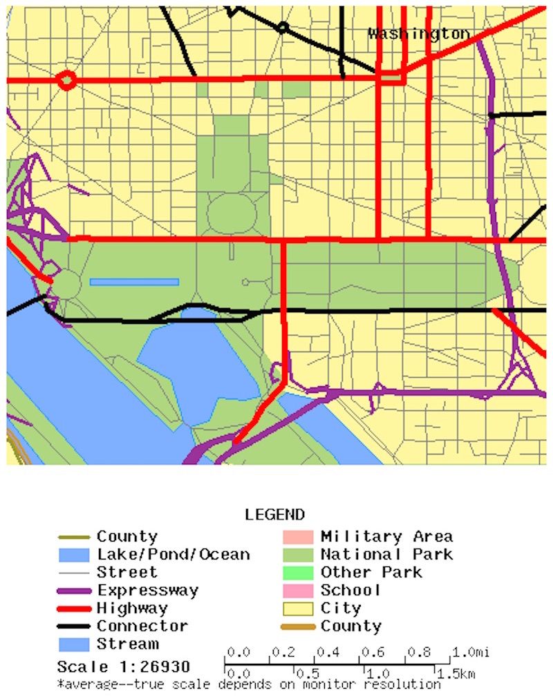 Map of Washington, D.C. area using the 1998 TIGER data set (Image: Courtesy of UChicago Press)
This born-digital map came from the Census Bureau’s TIGER data set—which was a key tool for the birth of web-based mapmaking.
2015
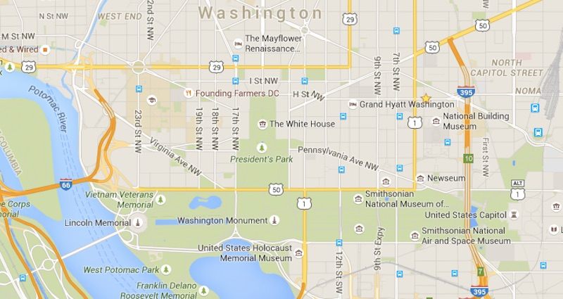 (Photo: Map data © 2015 Google)
Today’s digital maps incorporate features that were hardly dreamed of at the beginning of the 20th century—satellite imagery, interactivity, customization. We use these tools, routinely, without even thinking about it. Google Maps can tell you exactly how long it will take to get from Berlin to Timbuktu — by car, it’s an 88 hour drive. Or there’s a 9 hour flight to from Berlin to Mali’s capital, Bamako. Add on the 14 hour drive north, and you can make the journey in less than 24 hours.


Follow us on Twitter to get the latest on the world's hidden wonders.
Like us on Facebook to get the latest on the world's hidden wonders.
Follow us on Twitter Like us on Facebook