Why Isochrone Maps Are Enjoying a Renaissance
As data sources keep improving, mapmakers keep finding more uses for the 19th-century invention.
If you live in a city, getting together with friends can require intense socio-geographical negotiations. For instance, if you live in North London, and you want to see a friend who lives south of the Thames, you may find yourself in a pickle. Whose turn is it to cross the river this time, committing themselves to a long slog on the Underground?
Louisa Bainbridge is a North Londoner. She is also the marketing director for a mapping startup called iGeolise. When she runs into this particular problem, she says, she clicks over to the website for one of her company’s public-facing projects, “Travel Time Maps.” She plugs her address into one tab and her friend’s into the other, and chooses, say, “30 minutes on the train.” Out comes a map with two overlapping blotches:
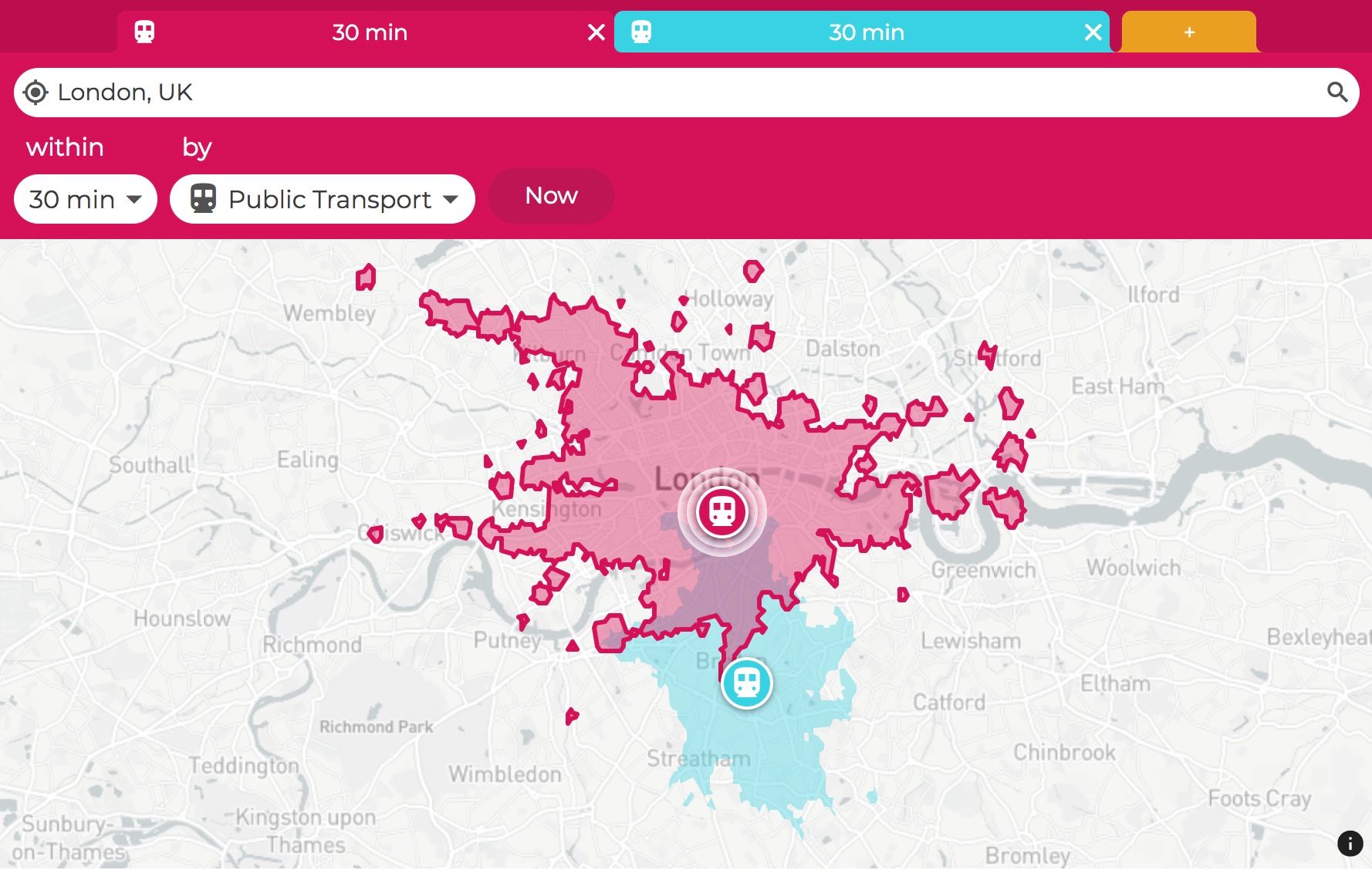
The red blotch shows the area that she can reach on the train in half an hour or less, and the blue one does the same for her friend. The purple zone in the center is where the twain shall meet. “I’m able to say, ‘You’re clearly not going to come to me, and I’m clearly not going to come to you,’” Bainbridge says. “But here is the middle ground.”
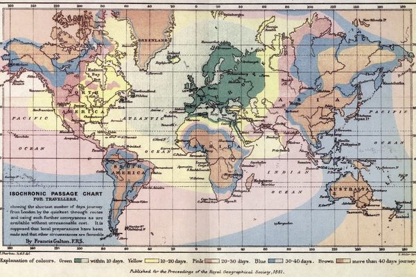
This blobby social lifesaver is an isochrone map: one that indicates not just the physical distance between places, but the amount of time it takes to get from one spot to another. When they were first introduced in the 19th century, individual isochrone maps tended to center on a particular place, and contained a set amount of information: one might tell you how many days’ journey it was from London to anywhere else in the world, while another showed how many hours it would take to get from the central train station in Melbourne, Australia, to a series of more remote stops.
Now, the increasing availability of geographical and transit-related data has led to an explosion in isochrone experiments. Whether you’re trying to shorten your commute, visualize transportation-related inequalities, or simply get coffee with someone who lives across the river, there’s probably a map for that.
2018 remake of my accessibility visualization. Rush hour travel times from my home to everywhere in Helsinki region with different modes of transport:
— Topi Tjukanov (@tjukanov) January 7, 2018
- Pink = Car
- Yellow = Public transportation
- Green = Bike
Made with #PostGIS + #QGIS pic.twitter.com/XhzOAW9FQJ
Taken trip by trip, isochrone maps have a pretty clear benefit: by laying out time, they can help you figure out how to save some. Take the isochrone time-lapse above, made by Twitter user Topi Tjukanov, in which different-colored dots take on rush hour in Helsinki: pink for driving, yellow for public transit, and green for bicycling. If you’re not going far, bicycling emerges as the most efficent choice; as the radius expands, though, other options might be better.
Individuals who use the Travel Time Map are often making similar decisions, trying to choose a new apartment that’s a reasonable commute from their job, or figure out a walkable neighborhood for a vacation, says Bainbridge. iGeolise also works with real estate agents, chain stores, and others who need to strategize about location. For instance, businesses may use their services to figure out where to relocate their offices. “Someone will send us a list of 300 employees they have, and five potential offices they’re analyzing, and we’ll calculate the new journey times for all of these employees,” says Bainbridge. This is especially helpful when public transit gets involved, as the time/space relationships enabled by subways aren’t always intuitive—evidenced by the video below.
But there are other uses for these maps as well. When you can actually see the time it takes to get somewhere or do something, inequalities and opportunity gaps become more apparent, and sometimes more visceral. Last month, the data scientist Chris Slatt used an isochrone map to show how much time it takes for residents in different parts of Prince George’s County, Maryland, to take public transit to jury duty. He concluded that under the current transit system, more than half of the county’s residents would be unable to make it all the way to the courthouse by the time it opens at 7:30 a.m.
Comparing different maps can also expand your sense of what is possible. When Stefan Wehrmeyer, a software engineer based in Berlin, first began work on his public transportation isochrone platform Mapnificent about ten years ago, he was just trying to get a handle on his own shifting commute, he says. Soon after that, though, he realized he could expand his map using a standardized, widely used data format called the General Transit Feed Specification, or GTFS. “I rewrote Mapnificent to make use of the available GTFS data, and now people all over the world can easily access an isochrone map based on public transit in their area,” he says. (Although many cities in Europe and North America use GTFS, not all of them do, and it is much less common on other continents.)
Within platforms like Mapnificent, being able to travel from country to country—or even just from neighborhood to neighborhood—enables comparisons, making clear the role public transit plays in a place overall. For example, Mapnificent works via a slider: as you pull it to the right, the travel time increases in 15-minute increments, and the bubble of accessible places expands in turn. The default maximum is 90 minutes, but it stretches longer when the data is available. In Manhattan, the slider goes up to four hours, which can get you as far as Newark, Perth Amboy, or Long Beach. “In cases where there’s GTFS data for the whole train system of a country like in Sweden or in Switzerland, the slider will go up to 12 hours,” Wehrmeyer says.
Another project, called Isoscope, from 2014, illustrated how traffic jams can compromise urban mobility by showing just how far (or not) drivers could get in 10 minutes in different cities during different times of the day. (“We wanted our project to shed light on situations when urban mobility is compromised,” its creators told Fast Company.) Such comparisons—even hypothetical ones—can also illuminate possible solutions. “Someone used [Mapnificent] as part of a campaign for better transit in their neighborhood,” says Wehrmeyer, by tweaking it to show how a proposed new transit line would fill in accessibility gaps.
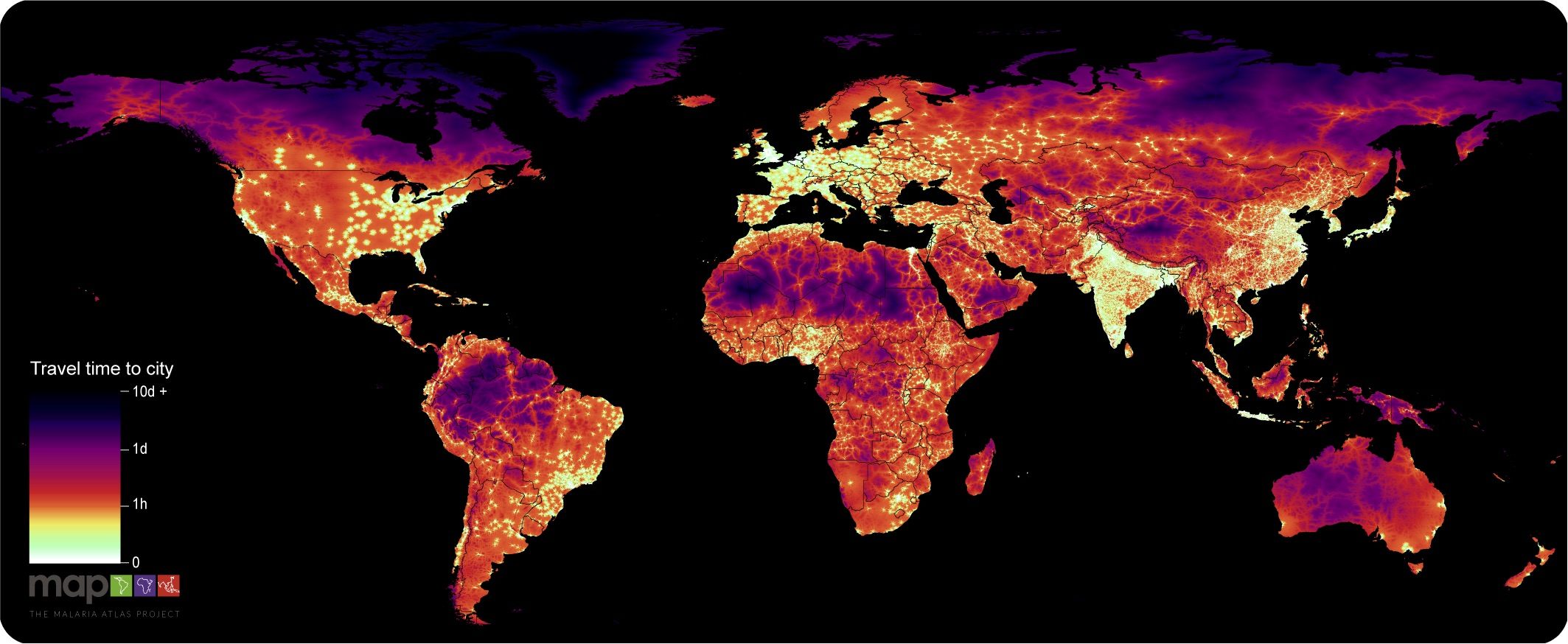
Some modern isochrone maps are still large-scale, but more detailed and decentralized than earlier efforts. Earlier this year, researchers at the University of Oxford’s Big Data Institute released an updated version of the “global accessibility map,” an isochrone map that indicates how long it takes to reach the nearest city from anywhere in the world. The paper’s lead author, Daniel Weiss, is an epidemiologist with the Malaria Atlas Project; as he explains, a person’s distance from a city might affect their ability to access vital services, including medicine. “We expect our new map to be widely used in mapping and modeling efforts… [and] we hope that it is also used by planners and policy makers to aid decisions about investments in infrastructure,” he says.
Isochrone maps can be world-expanding in a more direct way, too. Click around some of these maps, and realizations abound. Places that seemed annoyingly remote are well within the blob of possibility. A 15-minute walk actually can take you somewhere new. “It suggests a lot more to you than you would actually imagine you can do,” says Bainbridge. Or, if nothing else, maybe it’s finally time to meet up with that friend who moved across the river.


Follow us on Twitter to get the latest on the world's hidden wonders.
Like us on Facebook to get the latest on the world's hidden wonders.
Follow us on Twitter Like us on Facebook